The time-saving power of this site is only fully exploited if you get your hands dirty in the data. It not might seem like it’s saving time to begin with, but it will bring rewards quickly. And once you have built or identified a series of charts, tables and dashboards that help you watch and understand specific issues, you will be able to look deeper into the data than before. These blog posts are intended to help you with some of the most common tasks.
- To build a chart, you need first to choose a dataset. Follow the link in the navigation bar at the top of this page. Datasets can be viewed by topic, source or region. Choose “Source” and then select “OECD “.
- Your screen will look something like this

- Select ‘OECD Global Crude Steel Capacity by Country’ by clicking on the arrowhead on the left, then on ‘Select dataset’.
- That will take you to the dataviewer where all great charts begin. On the leftside of your screen there are a series of parameters by which you select your data. And on the right there is a selection of chart output formats.

- Begin by selecting your parameters on the left. Be aware that as you select a specific parameter, all other parameters are adjusted to present you only with the options that exist for your selection. The machine is fast so before you move to make your second selection, the options will already have been reset. You can experiment by choosing options in a different order.
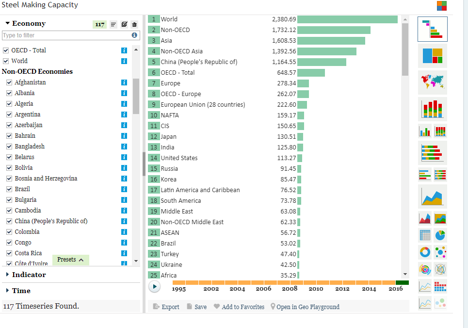
- You can select your parameters either by using the check boxes or, if you can’t see what you want you can enter it in the search box where it says ‘Type to filter’. Type ‘World’ in the Economy box and select it.
- You will see that you’ve already created a chart. This is not a complex dataset, so the machine has enough to present a simple chart of steel capacity. You can change the chart into a different type by selecting one of the chart types on the right.
- If you didn’t experiment with this symbol:

- Try it now. This is the ranking function and it can be very useful. Once you select it, you will see one bar across the top for ‘World’ capacity.
- Return to the ‘Economy’ selection panel. Select all countries and regions by clicking on the check mark. Your ranking chart should look like this:
- Underneath the chart you will see a series of options, Export, Save, etc. Select ‘Save’ and give your chart a title. Don’t forget to add tags just below the title so that when you’re searching for the topics you include in the tags, this chart will appear.
- Congratulations. You just saved your first chart.
- But of course you still might want to edit your chart. In the upper righthand corner, just above your chart, you will see (when you run your mouse over them), three small horizontal bars. Click on them and a menu will drop down with a number of options, including ‘Edit’. That edit button will take you to the chart editing window that allows you to tailor the way your chart looks. You can experiment with those settings. We’ll deal with them in another post.