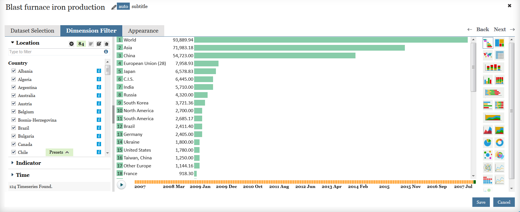
So you have found the data you are interested in and created a chart. Now you want to make the chart look exactly right. Once you have saved your rough chart in Data View, you can edit it further by accessing the Edit window. To do so, hover your cursor over the top-right corner of the chart, three horizontal lines will become visible. Click and a small window opens up. Choose ‘Edit’. This opens the full editing window where you can change almost anything about your chart from, most commonly, the chart’s appearance, or the chart title or the dataset that drives it. The edit window for a ranking chart of blast furnace iron production by country might look something like the one below.
We can change almost every element of your chart. At the top, you can change the title by selecting the pencil symbol. You can also add a subtitle. Note that naming elements of the chart in {curly brackets}, such as {Indicator}, {Measure}, {Country} will display the chosen content for each of those elements. This is useful if you want to save a copy of your chart and choose different specifics. The default title for this chart is your chosen Indicator while the default subtitle is the indicator units.
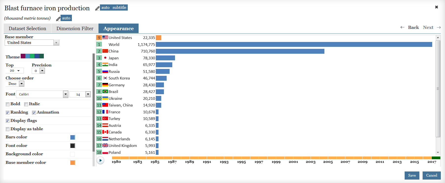
If you want to improve the appearance, select Appearance to the right of the Dimension Filter tab. This is where you can change everything about how the chart looks. For example, in the ranking chart above, you can choose to have one country always at the top in order to highlight it by choosing it as a Base Member. There are a number of other appearance changes you can experiment with such as changing the colors, fonts, adding flags for each country, changing the number of decimals in the units, etc. Here’s how your edit window may look after you’ve finished.
There are many other appearance edits available depending on the type of chart you are working on. For example, in a bar chart like the one below, under ‘General’ you can add a footnote with the name of the dataset (always a good practice). You can change the precision by which the data are displayed and you can edit the way ‘Tooltip’ is displayed. Under ‘Plot Area’, you can change the position of the legend or delete it, you can add gridlines. Under ‘Series’ you can display labels on each data point or change the name of the series. Finally, under ‘Axes’, you can set minimum and maximum value levels for each axis and even swap axes. It’s also here that you can ask the chart to ‘Ignore Units’. This is very useful. It is this entry that determines what is displayed as the {Units} in the subtitle above your chart. By asking the chart to ignore the units, it removes the title from the y-axis. This removes the duplication of units in both the subtitle and on the axis, and it gives your chart more room to be displayed.

Make sure you save your changes using the Save button below the chart on the right.
There are more complex types of edits we can make to our charts. You can change the dataset by going to the Dataset Selection tab. You can change what is included in the chart by selecting the Dimension filter. For example, in the ranking chart above, you can de-select regions under the Country filter if you want only individual countries, you can change from blast furnace iron production to direct reduced iron production under the Indicator filter, and you can de-select months under the Time filter if you want only annual data. Remember that editing one of the filters may then alter what is available in one of the other filters. For example, in this dataset above, if you choose countries only without including regions, the Time filter will allow you to choose data going back to 1980 instead of back only to 2007. We’ll deal with these more complex edits and others, such as adding data from more than one dataset, or using a calculation to change units from metric to short tons, but we will deal with those in another post.